

MedExplain
Designing a trustworthy and easily navigable hub for medical information.
Role
Design Project Lead
Timeline
August - December 2023
Team
2 Design Leads, 6 Consultants, 1 Developer
Tools/Skills
Figma
SUMMARY AND IMPACT
I led the design and product vision for MedExplain, a medical search engine platform. I guided our design team in conducting 65 user interviews, analyzing the current market, simplifying the information architecture, prototyping in Figma, and running usability tests. I managed client relations through weekly syncs with developers and organized standups/crit sessions with our design team. Upon testing, our team increased user satisfaction by 44.8% compared to the original product.
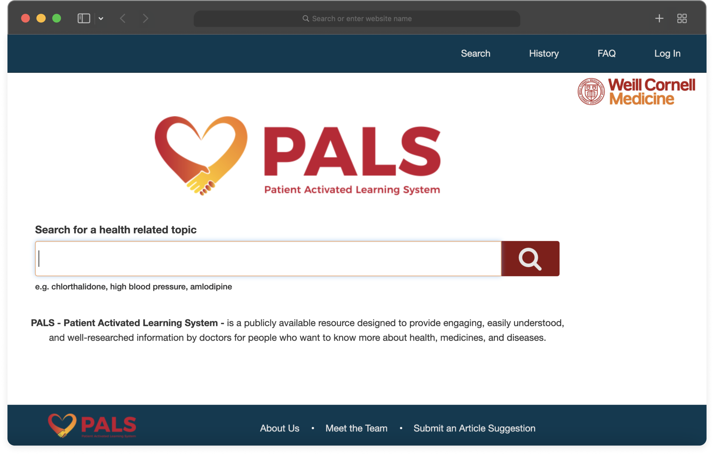
PROTOTYPE OVERVIEW
Finding reliable health information has never been simpler.
THE PROBLEM
The original platform design
Navigating health information online is overwhelming and unreliable.
In 2020, MedExplain launched their Patient Activated Learning System (PALS), a Weill Cornell Medicine-backed web platform that empowers users with low health literacy to obtain reliable medical information in a way that is easy to understand.
However, PALS lacked an accessible and streamlined navigation that was crucial in bridging gaps in health education and literacy. My team and I were faced with a challenge:
How might we redesign MedExplain’s platform for users with suboptimal health literacy to gain reliable and accessible medical information?
DEFINING DESIGN GOALS
We looked at 5 competitors in the online medical information space and found:

We decided to center our design goals around balancing professionalism with diverse content, highlighting credibility in direct ways, and providing information that is easy to digest.
How do others feel about navigating online medical information?
We conducted both interviews and surveys to further understand how users gather medical information. We did this to have qualitative data on current painpoints in the search experience and quantitative data on user satisfaction and trust.

Four themes emerged from affinity mapping our research findings:
UXR


Clicking into two pages was the most effective. The most recent song recommended to the user is at the top and the size of the song establishes a strong visual hierarchy that puts the song at the forefront of the recommendation. The user’s recommended songs to others were smaller due to the amount of desired information users may want, and the stacked profile pictures kept track of who songs were sent to.
Selecting followers to share your music
Once the share button is clicked, how would users actually go about selecting the people they want to share with?

I went with the list view to select followers because it aligns with Spotify’s existing interface for when you view a user’s followers/following. This is also the least crammed out of the screen options which allows for a familiar vertical visual flow of information.
Listening status and monitoring recommendations
One of the main insights gathered from user research was that there is a need for an efficient way to keep track of the status of songs you recommend to others. I designed a page that would highlight the listening status of the song that was recommended, as well as whether they liked the song.
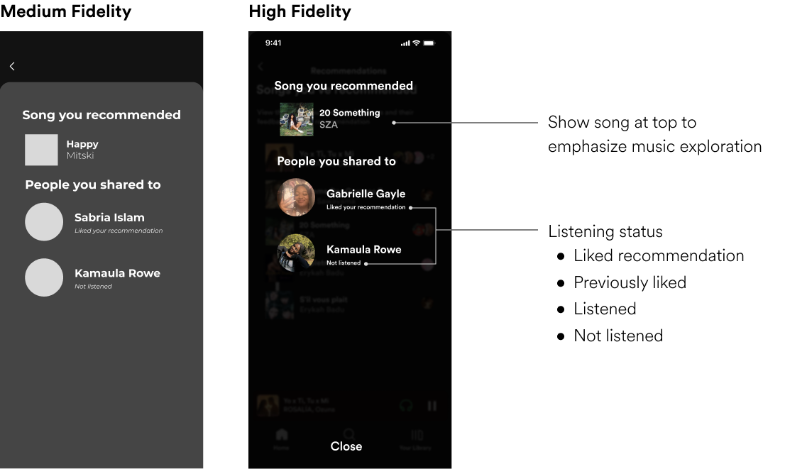
In my high-fidelity screen, I utilized a more familiar look that uses Spotify’s existing visual design. The information hierarchy also brings the song to the forefront, which not only serves as a functional reminder of the song being shared, but also establishes Spotify as a music-centered app rather than a social platform.
VISUAL DESIGN
To align with Spotify's existing designs, I made a UI kit from scratch

THE FINAL FEATURE
After prototyping and some preliminary user testing, Spotify Share was born!
The final feature includes an efficient way to access both songs recommended to you and songs that you’ve recommended. You can also view the status of a song that you’ve recommended, addressing pain points from my original user interviews.

Sharing a song

Viewing your recommendations
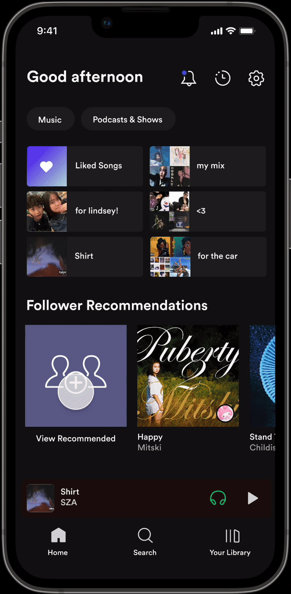
Monitoring recommendations
Upon testing my designs with users, I also prototyped entry points for monitoring recommendations in the intermediary page, which reduced an additional click to monitor from recently shared songs.
OUTCOMES
90% of users felt they were very or extremely likely to utilize the feature if launched!


If this concept were to be launched, some other metrics I would hope to measure are number of song shares, click-through rates, and average session duration within the feature.
TAKEAWAYS
User research is the foundation of it all.
Throughout my design process, I had to think critically and empathetically about each decision, connecting it back to insights from my user research. This made sure that what I was creating would effectively address the problem space.
The design process will not always look the same.
I did not have as many constraints compared to what I've experienced on other projects in this portfolio. I've grown to value this particular experience because I was allowed to let my creativity run freely, and ideate with full ownership.
The big picture: humanizing design not just gratifying, but necessary.
Music is a shared language that is powerful in developing deep connections with others. With the proper tools and features, we have the opportunity to extend this language and create a vehicle for connecting to others.
We made one user persona to provide our team with a clear, concentrated focus and
to maintain consistency in design decisions.
“Straight-to-the-Point Sarah” wants to find relevant medical information for her symptoms. But it’s tiresome because of oversaturated search results and walls of text that are difficult
to read.

ALIGNING THE TEAM
Focusing on credibility and navigability, I put pencil to paper.
I tasked our designers to each create for a breadth of ideas. Here are mine:
CONCEPT SKETCHES
We looked at different ways to synthesize our design concepts in Figma.
I tasked our designers to each create for a breadth of ideas. Here are mine:
ITERATE
Embedding trustworthiness in the visuals was crucial for this early-stage product.
I tasked our designers to each create for a breadth of ideas. Here are mine: